Human Interface Guidelines
LuneOS aims to be an unobtrusive personal assistant - ready with details, but never paternalistic. It focuses on people, not the providers of their on-line services, nor the idiosyncrasies of the computer systems they use.
LuneOS Assists the User via Well Chosen Alternatives
Using a LuneOS device is a dialog between the user and the device: the alternatives available depend on the data, the user's recent input, and the user-chosen information sources. It does not use an opaque profile gleaned by monitoring users communications (and sold to the highest bidder). It is deterministic, not based on experimental Artificial Intelligence.
Consider two incoming messages (handling should be similar whether they arrive via IM, email, Twitter, Facebook or something else). Relevance is decided by the user, not some algorithm with biases baked-in.
Alice says "ABC is the greatest thing since sliced bread". The user, unimpressed, swipes left to "dismiss" it.
Bob says "You should talk to Carol about XYZ at the meeting tomorrow". The user, curious, selects XYZ and swipes right to "adopt", which copies XYZ to Just Type. The system immediately searches the local DB8 database, finding no notes, to-do items, contacts, nor e-books containing XYZ - but does find an unread post in one of the user's RSS feeds, and offers to search for XYZ at the user's go-to website using OpenSearch, or a general web crawler. Another option is to translate XYZ via a user-chosen service. (So far, the user could be offline, and no information has left the user's device.)
Alternately, the user doesn't select anything and swipes right, copying the whole message to Just Type. Nothing matches the whole message, but a pattern matcher offers to open the Calendar to "tomorrow". Because the message is longer than a typical search, that's immediately followed by Quick Actions such as New To-Do (containing the text) and New Calendar Event.
Alternately, the user selects Carol and swipes right. Just Type displays all the Carols from the users contacts and groupware such as Slack or Basecamp. The user taps on the correct entry, and the system displays contact info for her, perhaps containing notes which make clear why Carol is the person to talk to.
Because LuneOS promotes moving info from one app to another, users can see something on a public channel, and reply on a private channel. This helps avoid public shaming, making the user a better member of his/her communities.
High-level Design Principles
- Assume the user has multiple accounts (and will add and drop accounts over time) that provide similar services.
- Avoid the anti-pattern of a different app for each service. Unify info from different sources (Synergy)
- Humans can only attend one event at a time, so the Calendar displays events from multiple servers on a single time-line.
- Humans communicate with people, not accounts:
- Tapping a person's name in Universal Search shows you various ways to contact that person (for example email, IM or phone).
- The Messaging app threads together all messages from the same person, regardless of different services.
- When a popular new service emerges, favor writing a Synergy Connector over writing an app. If the service provides a good mobile web app, there's no point in writing an app at all.
- Leverage the built-in contacts, calendars, communication, task and media APIs and services to provide infrastructure. Application APIs
- Messaging Synergy Connectors should create contact records for IM buddies. Synergy will associate existing contact info.
- Project Management software (such as Basecamp) should create contact records for everyone on the user's projects. This won't clutter listings, because searching in the phone app only shows contacts with phone numbers, searching in the email app only shows contacts with email addresses, and so forth. Favorite contacts allow the user to curate a short list of contacts.
- To-do and Project Management software should create Calendar records for any hard deadlines.
- Social networking software should use the media APIs, so shared photos and videos are just as accessible as the camera roll.
- Tapping a URL, email address, messaging address or telephone number, listed by an app should open a http:, mailto:, im:, or tel: URL.
- Tapping a date should launch the Calendar app to that date
- Tapping a location description should open a maploc: URL
- Allow the user to use his/her existing data and documents, to the extent possible. Carefully consider import and export of data.
- Cache data, so your app is usable offline and has something to display as soon as launched. LuneOS-specific apps should use DB8, cross-platform apps can use IndexDB. Use DB8 Watches so your UI stays current.
- Search and browsing are both first-class UI interactions
- Apps MUST work on both phone and tablet form factors.
- Sharing and sending user data off-device must be opt-in, not opt-out.
- Permissions must be appropriately granular, and changeable from the context where users care about them.
UI
General
- Assume users are distracted and might be interrupted
- Save user's data as you go; don't have an explicit Save button.
- Allow users to reverse mistakes. Archiving doesn't require confirmation. Permanent deletion generally should be a two-step process; favor archive & purge (like the desktop trash can) over "Are you sure?" dialogs (where users reflexively click OK). Note that "deleting" a DB8 record only sets the _isDel flag; records are periodically purged by the system.
- Allow users to partially-complete items (to the extent possible).
- Automatically back up data off-device [There is not good OS support for this yet.]
- Assume users pick up a device with a goal in mind. If the system needs the user to make a decision, don't use modal UI unless absolutely necessary.
- Support standard gestures
- Figure out what "back" means for your app, and hook it up to the back gesture. For example, switching to a panel that's logically "earlier", or clearing search text, so the full list is displayed.
- Scrollers should allow both dragging and flicking
- Lists
- Single-tapping a list item should show the full item.
- Allow reordering list items, if that makes sense. (Example: Searchable Notes)
- Long-press (tap & hold) either selects for re-arranging or re-sizing, or opens a context-sensitive menu. Basic operation should not require long-presses.
- Consider implementing the Swipe UI [Enyo DataLists will not support swipeable items until after 2.6. Until then, a long-press can open a non-modal toaster.]
- Double-tap, spread, and pinch are mostly used in the browser and pictures.
- 2-finger gestures: not currently supported, and use To Be Decided
- Each preference needs a strong justification to exist.
- Only have preferences that users care about (for example, sorting by surname or given name).
- Go the extra mile to manage details automatically. For example, the Email app can usually figure out if a provider supports IMAP or POP.
- Carefully pick defaults; most users will go with default values
- Support System Preferences, such as left-right hand operation, and nighttime styles. [Details have not yet been worked out for these.]
- Search is a first-class UI interaction
- Support Just Type (Universal Search)
- Enyo 2.7 apps can use InputSearchStretch to include a search field without taking up much screen real estate.
- Search should have a single text field; no additional selectors or Search button.
- Search should be live, updating the display after every keypress. (Example: Searchable Notes)
- Normalize search terms by folding case and ignoring irrelevant punctuation. Typically, match against the first part of words.
- Typically, space-separated search terms are ANDed. OR is not directly implemented, but search should be so fast that users can backspace and search a second term. Approximate matching and ordering the results by relevance my be possible in some cases.
- Search all appropriate database fields. For example, search in Contacts matches by given name, surname, middle names, first initial+last name, nickname, organization, email addresses (before the @-sign) and messaging addresses.
- Either order the results the same as an unfiltered list, or sort by relevance
- Browsing is a first-class UI interaction
- If items can be selected by tags or categories, provide an all-tags or all-categories listing.
- Favor a model where items have multiple tags, over items having a single category.
- Small icons in listings aid visual search, by giving the list "texture". (For example, a user may not remember the name of the item he/she is searching for, but remember it had two icons in front.)
- Allow users to arrange or order items
- Support Copy & Paste and Universal Search actions
- Support copying of text if at all possible
- Support pasting text wherever it makes sense
- Make it easy to push text to the Universal Search field, for re-use by other apps.
- Support Quick Actions from Universal Search
- Popup UI
- Buttons on dialogs and toasters should have action verbs, for example "Send", "Delete", or "Cancel". Avoid "Yes", "No", and "OK" if you reasonably can.
- A couple buttons with short labels can be arranged horizontally, if they fit on a phone-size display. Long labels or multiple buttons should be arranged vertically.
- For right-hand operation, place "Cancel" the the left hand side. Reverse this for left-hand layout.
- Use color intelligently. Half or fewer of the buttons should be colored. For example, use
classes: "onyx-affirmative"on a Send button, orclasses: "onyx-negative"on an irreversible delete. - See Creating Usable UI - Buttons (but note the code is Enyo v1).
Visual Design
- Visual design should use realistic data, varying in length, rather than lorem ipsum. See [ https://lists.design lists.design]
- Make users' hastily-scribbled notes look good.
- Tap targets should be at least 48 CSS pixels tall and wide - that's about two lines of text
- Allow for screens as narrow or short as 384 CSS pixels
- Set
max-widthon columns of text to 35em. Set left and right margins to auto, so the column will be centered.
Notifications, Warnings & Secondary Windows
UI Types
- In place: input text turns red, message next to group of controls, etc.
- Drawers (using the HTML5 details and summary elements or onyx.Drawer) and panes "deeper" in app navigation
- Toaster (non-modal)
- Dialog box or full-window pane (modal)
- Banner messages (transient; unstyled text + small icon; can send when app minimized; tapping re-launches app) banner message image Only one banner can be displayed at a time. The system displays a banner for five seconds, or two seconds if another banner is queued up. While a banner message is displayed, it takes the place of the Notification Bar.
- Notification Bar (a narrow bar of icons) Only available in conjunction with Dashboards.
- On phones, appears at the bottom in portrait mode, only when one or more Dashboards exist. Tapping it hides it and displays all Dashboards.
- On tablets, always appears at the top of the screen, in either landscape or portrait mode. Tapping it leaves it visible and displays all Dashboards.
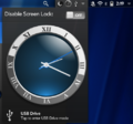
- Dashboard (non-modal; associated with icon in Notification Bar; can be created when app minimized; persists until dismissed by user, even if card dismissed) Can contain controls.
- System popup (non-modal but intrusive; only one per device at a time; can open when app minimized; persists until dismissed by user, even if card dismissed) Must contain controls.
- Audio alarms and/or vibration
- Flashing LED (on some hardware). The system starts flashing the LED when a dashboard or system popup is created with the screen off. The LED only flashes until the user turns the screen on.
Errors, Warnings & Messages
- Help users resolve problems themselves. For example, if a backup directory can't be written, tell the user "Pick a different backup directory" and display a file picker.
- Cue the user about bad input while they are entering it, typically using HTML5 input element validation. However, don't be too restrictive. (For example, it's effectively impossible to validate email addresses using regular expressions, and it's far more likely that the user will enter a valid, but incorrect, e-mail address.)
- Messages that relate to one control or group should be adjacent to that control or group.
- When no relevant UI is displayed, a banner messages may be used. (For example, when the user taps a "Send Support E-mail" button, which launches the Email app, a banner message might say "Enter a description of your issue".)
- Transient error conditions should use transient messages. (For example, a sync that fails (when the device is not in Airplane Mode).)
- Status info (such as the time of the last successful sync) should be in a Drawer or pane "deeper" in app navigation.
- If the user must make a choice, use a non-modal toaster.
- Modal dialogs or panes should only be used if the app cannot continue without the info. (For example, if an account must be set up before the app is usable.)
- Dashboards should not be used for transient nor low-importance warnings nor errors. They should be used when user action is required to correct a serious issue. (Example: low battery requiring the user to recharge soon. Example: a weather alert app requiring a location to actually receive weather alerts.)
- Apps should not use System Popups for warnings nor errors.
- Sound and/or vibration should accompany only urgent & important message (I.e. only when a conscientious human assistant would interrupt.)
Notifications
- When new items are added via sync, an app may create a dashboard. For example, sync of email creates a dashboard when new messages arrive, but sync of contacts does not.
- When an app creates a dashboard, it may also send a banner message. Example: Messaging. Counter-example: Email.
- A to-do app may create one dashboard to remind users of all tasks scheduled for today.
- "Notification" dashboards should be standard height. Typically, they have an icon on the left, with a badge for the number of new items. Tapping this typically opens the a card to a list of items. On the right, the text of one item is displayed. Tapping this opens a card showing that item in full.
- System popups are used when it is urgent that the user make a choice. For example, answering an incoming phone call or letting it go to voicemail.
- The Calendar app opens a system popup to remind users of imminent events, that the user asked to be reminded of.
Time Scales
- If the user needs to take action in seconds, use a system popup with sound/vibration.
- If the user needs to take action in a few minutes, use a banner message + dashboard with sound/vibration.
- If the user needs to take action in minutes to hours, use a banner message + dashboard.
- If the user needs to take action today, use a dashboard.
- Events that originate with the user may use more intrusive notification than events that originate elsewhere.
- When different users may act on different time scales, use a preference. (For example, typically users prefer audio/vibration when an instant message arrives, but some users may not.)
Secondary Windows & Desk Accessories
- Apps may put controls in a Dashboard for quick access. Example: When the music player is minimized, it creates a dashboard with play/pause, next & previous buttons, and the song name and artist.
- Apps that are primarily used via a Dashboard or System popup are called "desk accessories". When launched, such apps typically display a card with instructions.
- Examples:
- calculator
- stopwatch
- scrapbook
- "Desk accessory" Dashboards that the user initiates may be taller than standard.

Standard-height "notification" dashboards on phone
Standard-height "notification" dashboards on tablet
Tall "desk accessory" dashboard
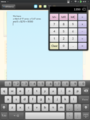
"desk accessory" calculator in system popup


Dynamic dashboard template for Enyo 2 apps
Text
- Text should tell the user how to resolve the situation, using control labels where possible. (For example, "The Start Date must be before the Stop Date", "Check the user name and password", "Ask an administrator to upgrade your account", "Quit and restart this app", or, for really unexpected errors, "Please report this error".)
- Avoid negative phrases ("invalid account", "server error").
- Minimize superfluous words like "please"
- Technical details should be hidden behind a disclosure triangle.
The Application Menu
T.B.D.
Transitions
- Cross-fades are often used when switching to info at the same level.
Cards
- Only use multiple cards only for separate user tasks. For example, composing an email uses a different card than reading received emails.
Resource Usage
Apps that have no cards, dashboards or system popups will be killed by the system. JavaScript Services are killed after a timeout unless they are called again. To keep a service running, don't increase its timeout. Arrange for it to be called regularly.
Minimized
While not maximized, apps continue to run. They should detect minimization events, and stop animation and other expensive operations. setTimeout calls will return, but the timeout will be many times the specified one.
Services & Actions
Apps and Synergy Connectors should use JavaScript Services, started by Actions, to sync data. Typically, the Action will require that an internet connection be available before the sync starts. High-bandwidth syncs might specify that a wifi connection be available. Actions can also help battery life by "batching" syncs. Always provide a way for the user to cancel any future background activity.
Typical User Interface
The main user interface in a webOS Ports app generally focuses on a screen size-aware enyo.Panels kind and a gesture area (virtual or otherwise).
Commonly, the top-level layout uses an enyo.Panels with a CollapsingArranger, which adapts to both tablet- and phone-size screens.
The first panel, which is referred to as the Menu Panel, should contain the app's main menu. The second panel contains the content associated with the main menu's options. This is the Content Panel and it usually starts off blank. Most often a second enyo.Panels kind is nested inside this one to allow for easy transitions between content.
Reference Apps
The best references to work from when implementing a webOS Ports style UI are the existing core app rewrites:
Proposed Extensions
Consider implementing the Swipe UI
Analyze whether Intents would simplify your app.
[Siempo] has a few interesting features we might want to have a look at.